2025/09/11(木)アクセシブルなトグルボタンをHTMLとCSSで書く
更新日:
投稿日:
投稿日:
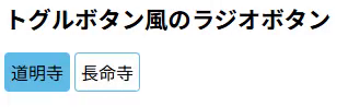
こんな感じにフォーカスが当たるとOS標準の枠が出て、矢印キーの左右で選択状態を切り替えられる<input type="radio" />要素の作り方。
大まかには<label><input type="radio" /></label>の構造にして、UI上はラベルを疑似要素的に表示し、ラジオボタン本体はUI上見えなくするが、display: none;にせず、画面に残すことによってタブ遷移できるフォーカス可能要素として設計する内容。
サンプルコード
CSS
/* ラジオボタンを等間隔に整列し、左右に余計な空白を持たせない */
.radio-container {
    display: flex;
    column-gap: 0.25rem;
}

.hidden-radio {
    /* チェックを消す */
    appearance: none;

    /* 非推奨要素を使っているが、iOS Safari対策 */
    position: absolute;
    clip: rect(0, 0, 0, 0);
    pointer-events: none;

    /* デフォルトマージンがチェックボックスの位置にあるので消す */
    margin: 0;
}

.radio-label {
    /* 文字列要素を綺麗に中央寄せする */
    display: flex;
    justify-content: center;
    align-items: center;

    /* 枠装飾、基本的にフォーカス枠が角丸であり、違和感がないようにborderも角丸にしておく */
    padding: 5px;
    border: 1px solid #60bce9;
    border-radius: 4px;

    /* 見かけ上ボタンなのでカーソルをボタン用にする */
    cursor: pointer;
}

/* ラジオチェック時にラベルの背景色を変化させる */
.radio-label:has(.hidden-radio:checked) {
    background-color: #60bce9;
}

/* ラジオフォーカス時にラベルのフォーカス枠を出す */
.radio-label:has(.hidden-radio:checked):focus-within {
    outline: auto;
}
HTML
<form>
    <div class="radio-container">
        <label class="radio-label">
            <input name="r2" type="radio" class="hidden-radio" value="1" checked />
            <span>道明寺</span>
        </label>
        <label class="radio-label">
            <input name="r2" type="radio" class="hidden-radio" value="2" />
            <span>長命寺</span>
        </label>
    </div>
</form>